West Side Story: Exploring Colour Theory
- Chloe
- May 14, 2020
- 9 min read


I adore musicals.
There's something so magical about a world where people can burst into song and dance whenever words become insufficient.
One of my most anticipated film releases of this year is Lin Manuel Miranda's "In the Heights" based on his pre-hamilton stage musical of the same name.
In the Heights owes a lot to another famous musical which has recently been re-made and due for a 2020 release. That musical is West Side Story which in my opinion is the best filmed musical of all time.
This isn't because I think it's the best story (it is essentially Romeo and Juliet with the Montagues and Capulets exchanged for Puerto Rican immigrants and a gang of racist Americans) but because of the way it uses the medium of film to create atmosphere and subtext, making a completely different experience to seeing it in a theatre.
Lots of musicals have been adapted from stage to screen but West Side Story stands out as a huge achievement in cinematography and production design. Cinematographer Daniel L. Fapp well deserves his oscar for the stunning visuals and striking use of colour.
Colour plays an important part in the story of these two star crossed lovers making West Side Story the perfect case study for exploring colour theory.

1. Introduction to Colour Theory
Colour theory is an umbrella term used to describe the science, psychology and art of how we perceive colour.
Different objects reflect light in different combinations of wavelengths. Our brian picks up on these combinations of wavelengths and translates them into the colours we see around us.
Colour theory is often discussed in terms of the colour wheel you can see on the diagram above which was first designed by Sir Isaac Newton. Half of the colour wheel has "warm" colours which are reds and oranges and the other half has "cool" colours like blues and purples.
We can change colours in four ways. We can change the Hue which is the colour itself, the shade of the colour (adding black), the tint of the colour (adding white) and the tone/saturation of the colour which is adding grey making the colour less intense.
If these sound familiar to you it's probably because they are the options you get on editing software like Premiere Pro and DaVinci Resolve when you're colour grading.
From the 12 colours on the wheel we can start to build colour schemes. The different types of colour schemes are:
Monochromatic: Different saturations of the same hue.
Analogous: Hue's that are next to each other on the colour wheel.
Complimentary: Hue's opposite each other on the colour wheel.
Triadic: Three colours spaced evenly on the colour wheel.
Split Complementary: A hue and the two colours on either side of it's complementary hue.
The second element of colour theory is that colours have symbolic meanings attached to them. Not all colours mean the same thing across all cultures as you can see in this chart.

An example of how colour can be interpreted differently across cultures is the colour red. In Western culture red can be a symbol of danger or passion but in Eastern culture red is a colour of good fortune, happiness and a long life.
In film, colours can be used for aesthetic and symbolic purposes and can be implemented in the production design, cinematography and colour grading.

2. West Side Story
West Side Story is the story of star crossed lovers Tony and Maria caught between two warring gangs; the Jet's, a group of poverty stricken young white americans and the Sharks, a group of Puerto Rican immigrants who came to America for a new life only to become targets of racist abuse. Maria is Puerto Rican, her brother Bernardo is the head of the Sharks. Tony has friends in the Jet's but chooses not to associate with them.
There is so much detail in this film from recurring musical motifs to clever camera movements but we are focusing only on colour theory today and how this film uses it to foreshadow, add character, create mood and add important subtext. To do this we're going to focus on a few key scenes.
3. Maria
After Tony's first meeting with Maria we get what is arguably the most famous song of the film.
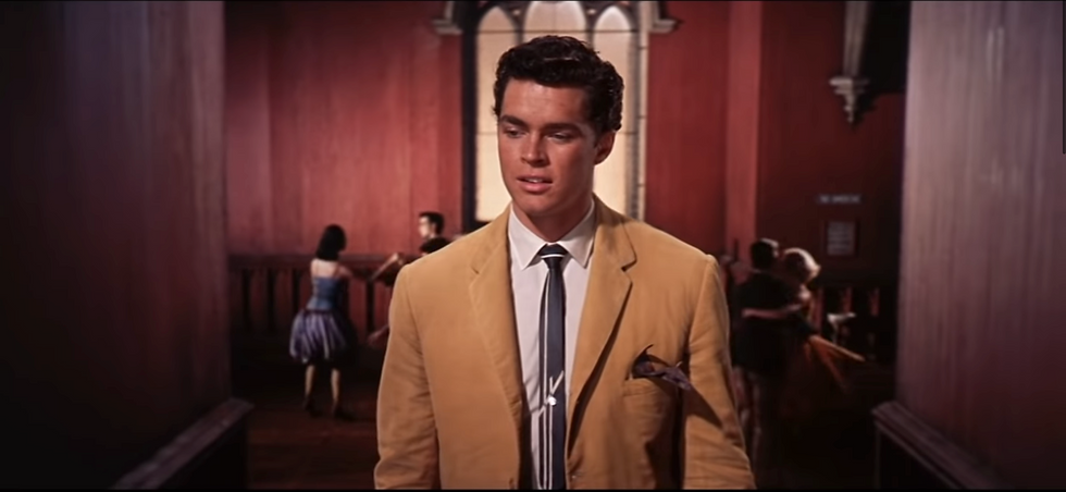
For this sequence Tony is wearing the Jet's yellow mustard coat. When worn by the Jets this could be a warning, portraying them as a hazard but in this scene with only Tony the yellow could indicate happiness and hope. The background behind Tony is projected, making him look like he's floating through the red corridor symbolic of him not being aware of the danger this moment will put him in or that this initial meeting will seal his fate.


Then the colour scheme changes from an analogous one to a monochromatic one as the screen is flooded with an intense pink light. Tony's love for Maria overpowering any other thoughts and conflict. Even his yellow jacket becomes a shade of pink as he sings about the girl he just met. It is notable that in the frame above there is still a bright red light in the background, perhaps foreshadowing how Tony's blindness by love will lead him to danger.

One of my favourite frames from the film is when the pink fades and Tony passes by rows of bright green windows. At first this frame confused me. The shade of mustard yellow is restored to Tony's jacket, the light reflected on the floor is purple and the dominant colour is green. This is a striking split complementary colour scheme we don't see anywhere else in the film.
In my interpretation the purple light represents the Puerto Rican's that Tony hopes to walk amongst because of his love for Maria but his jacket is a reminder of what side he is actually on even if he didn't choose it. Purple is a colour that gets associated with the Puerto Rican's multiple times throughout the film but we'll come back to that.
Green could represent envy but I don't think Tony is a character that would be jealous of the Puerto Rican's. Personally I think the green is meant to symbolise regeneration and new birth. It is a moment of clarity for Tony where the character is fundamentally changed. Green isn't a colour used by either gangs, putting Tony on his own. It's a metaphoric representation of him realising he belongs to neither side.

2. The Dance
The fights in West Side Story are demonstrated through dance and although this dance sequence isn't meant to be violent the way it's constructed and the colours it uses parallels the films most violent scene. The red walls and industrial looking space are very similar to where the big fight between the Sharks and the Jets will take place. The key difference is the tint of the colours is much lighter creating a more upbeat atmosphere.
The interesting thing about the colour scheme in this scene is that there doesn't appear to be one. Yellow, orange, blue, red and purple seems like a fairly random mix until your realise that there's not one, not two, but three colour schemes at work here.
The first is the most noticeable red, yellow, blue triadic colour scheme which takes the scenes most dominant colours. Then each gang has their own colour scheme. The Jets have a split complementary scheme of yellow, orange and blue and the Sharks have an analogous colour scheme of red, maroon and purple. These colour schemes follow the gangs around and are most notable when they're separated.

This frame is taken from the America song and dance number. The red hue of the women's dresses is brighter than the red colour used to indicate danger. This red could indicate excitement and adventure. Purple is often considered to be a colour of nobility or luxury but it can also be used as a colour of faith and spirituality. This could be representative of the stubborn faith the Pueto Ricans have in themselves to the extent that they are not willing to make friends or relationships outside their own circle.
This sequence shows the conflict not just between the Jets and the Sharks but also the inner conflict of an immigrant. The battle to stay true to a culture at the detriment of fitting in, picking a side to stay safe against racist groups whilst also trying to embrace the new culture they're now living in. The colour purple presents these characters as strong and influential even if inside they are conflicted.
In some cultures purple is also a symbol of grief and mourning. Foreshadowing perhaps?

Even the gates and shop have been painted in line with the Jet's colour scheme during the officer Krupke song. This is the Jet's equivalent of the America song, where they try to explain why they are the way they are. While the audience are against their beliefs there is a humanising element to this song where they sing in a fairly candid way, some of the problems they encountered during their childhood and how everyone seemed to be able to diagnose the problem but nobody seems to be able to help. It's the whole nature vs nurture argument. Are they inherently bad people or have they been brought up in a bad environment.
The existence of Tony proves that these boys didn't have to turn out the way they are but at this stage it would take something big to make them change their ways.


Back to the dance. Maria is dressed in white, often used as a symbol of purity. Her mind isn't tainted by the conflict around her. Her orange belt is a symbol of vitality and creativity. It's no mistake that during the "I feel pretty" scene she is wearing a bright orange dress.
White also separates Maria from the Sharks the same way green separates Tony from the Jets. I love this sequence where the middle of the frame is blurred showing that Tony and Maria only have eyes for each other. The blur creates a gradient from one side to the other showing that there is a path.

In the final scene of the dance number the red (representing danger) fades away, and the different colour schemes of both sides fade away, leaving both sides common colour, blue, creating a sense of calm. There are a few red specks which could represent the afterthought of violence but we now have our first specks of green too, indicating Tony's departure from the Jets. The colours here are also less saturated and a darker shade than before, apart from the main characters who have gotten brighter.

3. Somewhere
Near the end of the film, this scene is the accumulation of all the colour subtext used earlier on. Tony is not wearing his yellow blazer. Instead he's wearing brown showing how his character has been tainted by his murder of Bernardo. He's framed in an orange square of light, aligning him and his actions with the Jets. Maria is framed in purple. In her time of grief she has decided which side she belongs on.
Maria is wearing white again but it is not the pure white from before. It's more of a grey colour. Her innocence has been taken away from her.


Now it gets a little more complicated. When they stand up to kiss intense red panels are revealed. This is not the dark red that is used to indicate danger. This red shows their love for each other and their passion. We also see a green panel, Maria sees how he is different. How he never intended to kill Bernardo.
The fact that these colours are so saturated around their silhouettes shows how overpowering the conflict is around them. Their emotions of grief, self identity and love are dominating everything.

In one of my favourite frames they are separated by black bars. Black is the most common symbol of death and mourning. Death will always come between them, first the death of Bernardo and then the death of Tony. The colours around them show a wide range of emotions. Pink is the dominant colour but it isn't as saturated as in the Maria scene. It's present but now shares the frame with multiple other emotions.

5. Why colour theory is awesome
All of this is up for interpretation. Colours have multiple different meanings often contradicting each other and even the slightest change in shade or tint can create a wholly new atmosphere.
The remake of West Side Story is yet to be released but from the few promotional pictures I could find the colour schemes are completely different. The Jets are now dressed in blues and greens while the Sharks are dressed in reds and oranges. Blue is the dominant colour in this frame, which I assume is from the dance, instead of the saturated red walls.

Using yellow in the America sequence creates a completely new vibe to the song. Yellow is a colour of joy and hope so I can completely understand this decision. Although the colours are bright they are not as overly saturated as in the original, maybe they are going for a slightly more realistic look?
Colour schemes are a lot of fun to play around with and can add production value to a film. What colour schemes are your favourite? Let me know on Facebook or Twitter!


Comments